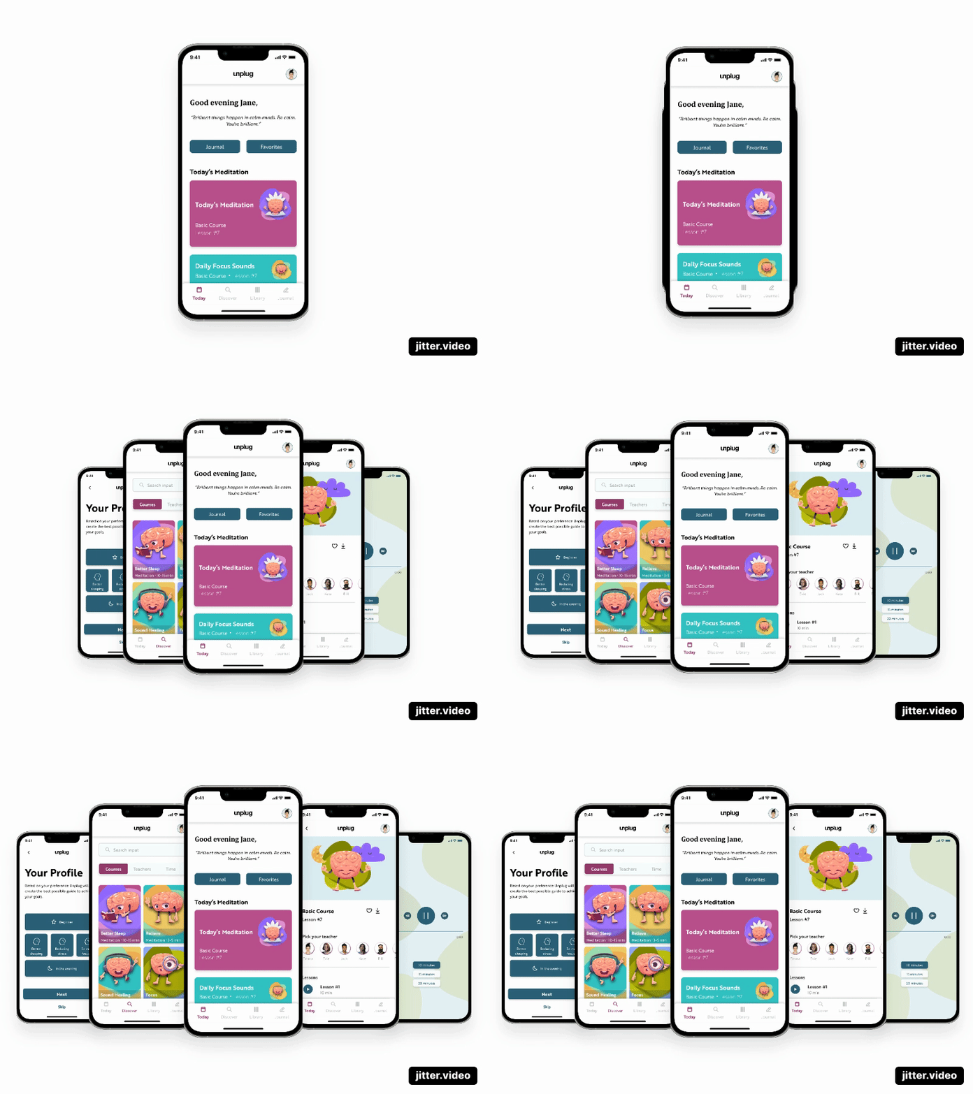
Unplug
Project Details
- Project name: Unplug UI Redesign
- Client name: Memorisely
- Platform: Mobile Application
- My role: UI designer
Outcome
Unplug Meditation application with the mission to make it effortless to learn, and to inspire to pause, breathe and unplug daily. When you experience the powerful effects, including deleting stress, increasing productivity, finding your purpose in life and becoming calmer, healthier and happier, you get hooked!
The current design is described by Unplug as a clean and modern design that calms you the instant you log on with inspirational and highly trained teachers who expertly guide you through the Unplug experience. Unplug’s redesign showcases an improved overall interface with a clear hierarchy of information, an accessible color palette and an improved general experience of finding and selecting.
Challenges
The challenge is to create an effortless learning flow, that the user inspires to use Unplug on a daily basis. With an accessible color palette, clear information hierarchy and a clear general experience of finding and selecting within the Unplug app.
With a rather competitive market with settled brands, such as Headspace, Calm, Meditation Moments and Chopra, Unplug also has a huge target group. Users are between the age group of 6 to 96 years old. To conclude, Unplug wants it all and this is something that the user interface shows. Unplug tries to provide the user with all kinds of services and features what causes an unclear user interface without segments and information hierarchy.
The biggest challenge is to select and categorize the right information. Choose the relevant information in establishing a clear information hierarchy, while redesign Unplug the app with an accessible color palette and a seamless general experience of finding and selecting meditation sessions.
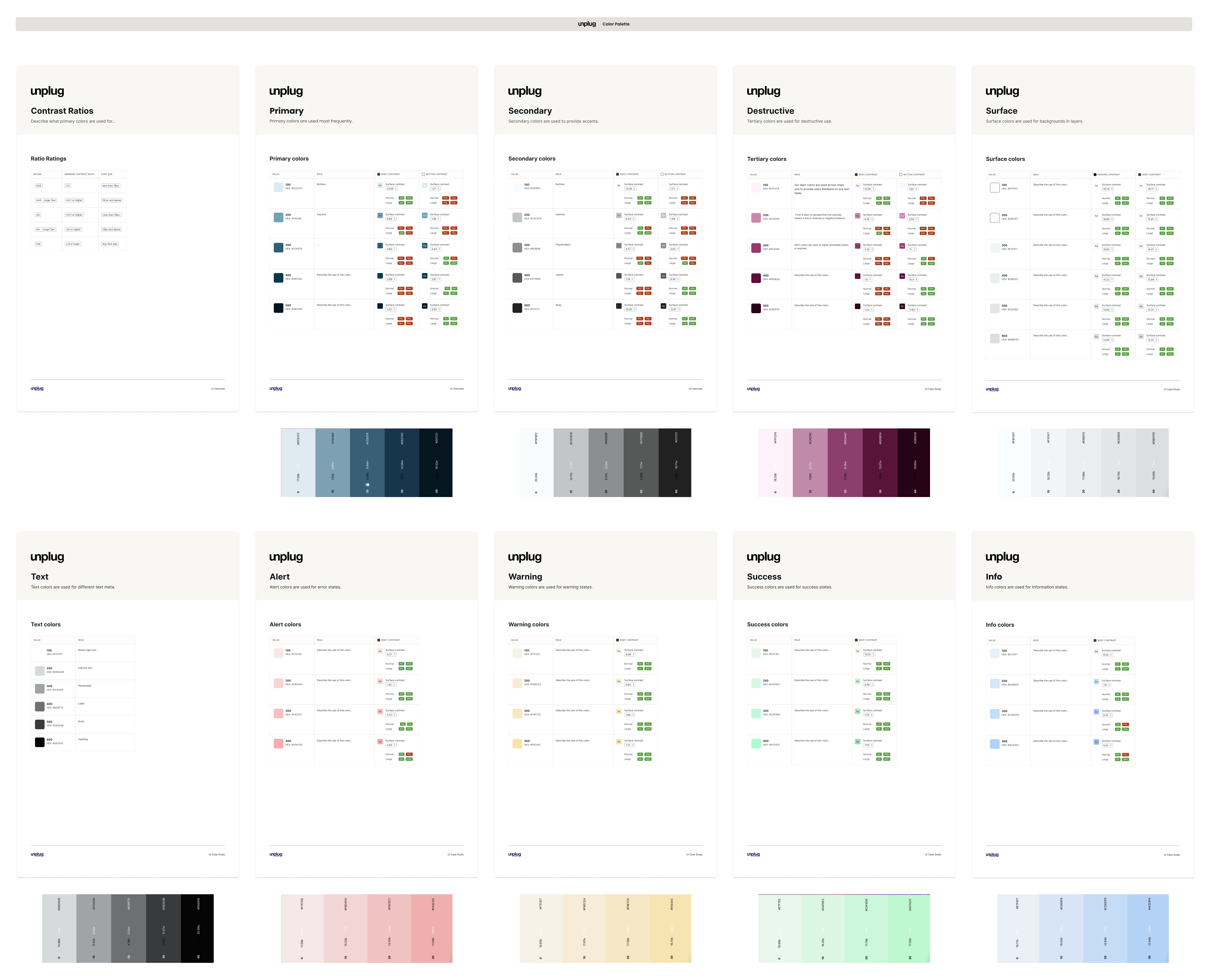
Unplug – Color Palette
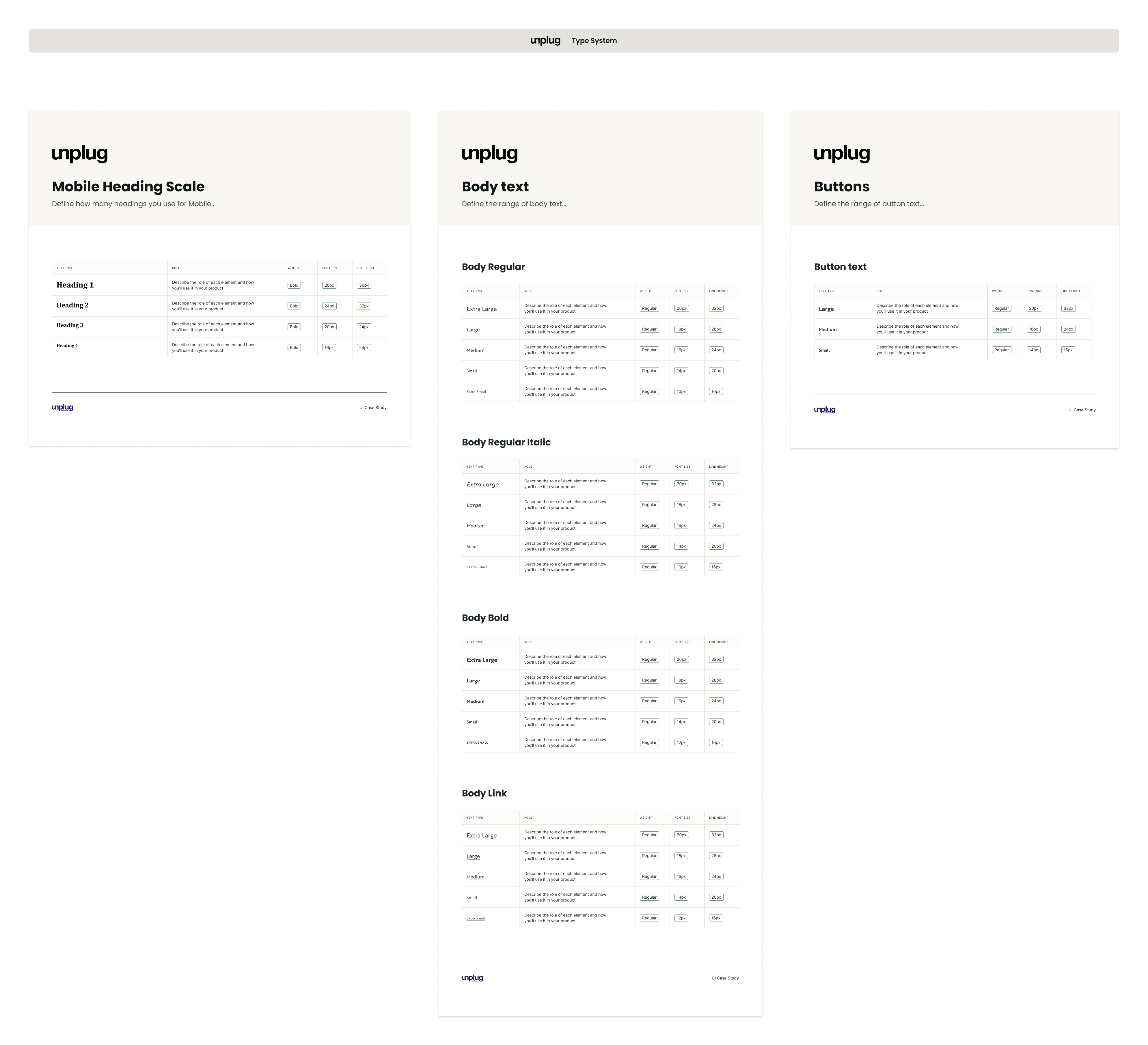
Unplug – Type System
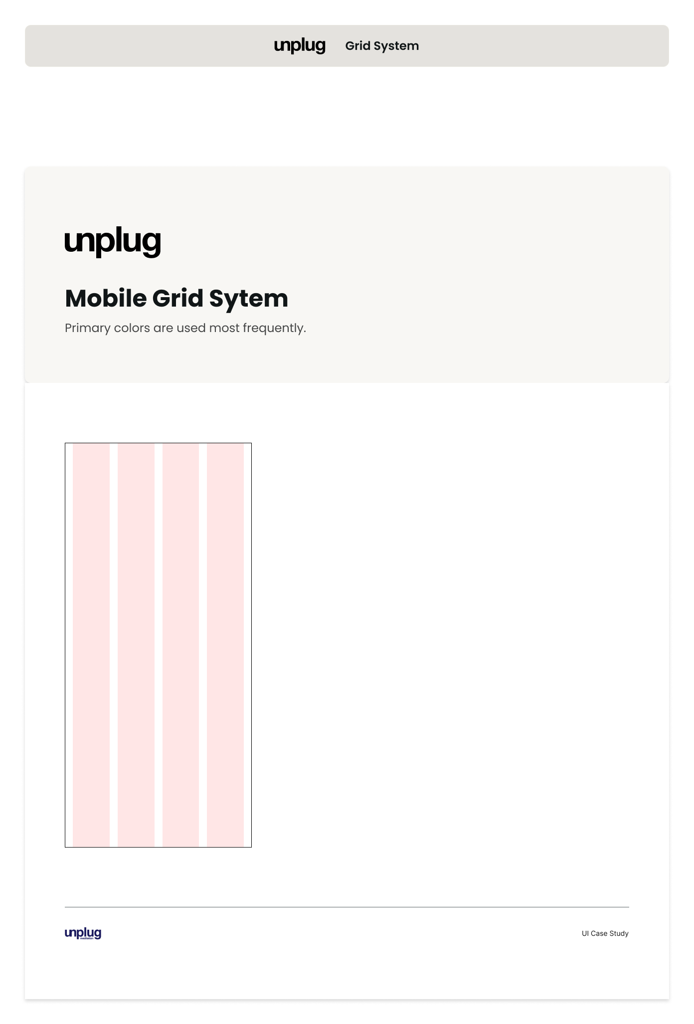
Unplug – Grid System
Process
The process can be divided in three steps. The first is UX research, the second step is the UI research and the final step is redesigning the Unplug app.
1. UX research
The process started with researching Unplug. What is their core business? What is their mission? What do they want to achieve? Who is their target group? What is their look and feel? Are they accessible? And are they able to compete with their competitors? Who are their competitors?
The app has been made visual insightful by creating a flow in Figma. Screenshots were taken from the app and placed in the right order of the app. Not only the unclear user experience was exposed, but also the unclear information hierarchy. In this case, less is more.
2. UI research
With the flaws being exposed, UI research was followed. With screen descriptions a new flow was made. To play with the UI looks and feel, a mood board was created and colors were tested on accessibility. Finally low-fidelity sketches were created with an improved information hierarchy.
3. Redesign Unplug
To improve the overall user interface a small basic design system was created. This new design system contains of a new color palette with accessibility checks, text layers and defined type scales and a mobile grid system. With this foundations, buttons, text fields, icons and other base components where created.
During the design phase advanced components were created whereby the base components were being used. The end product consists of an interactive prototype in Figma.
Metrics & Validation
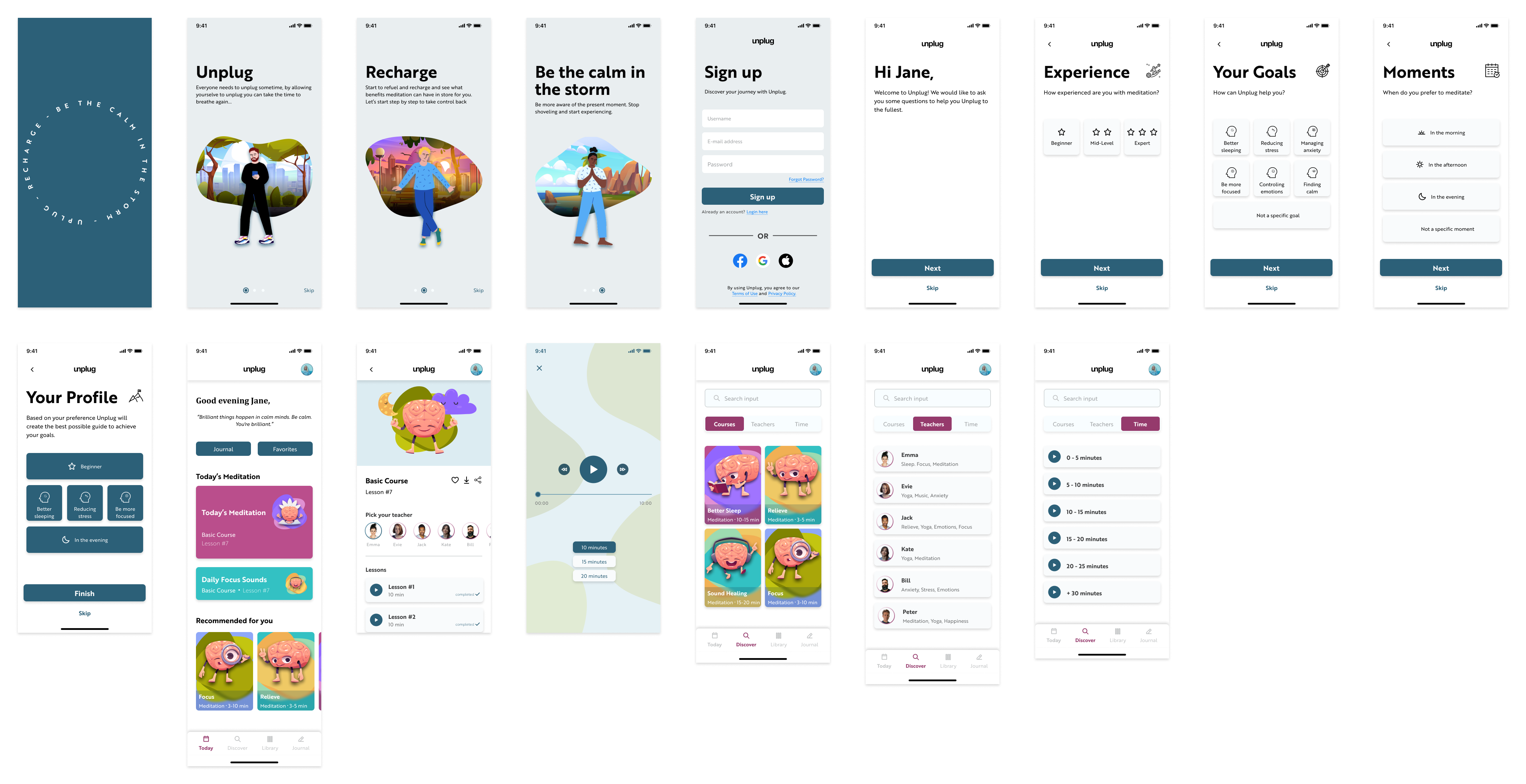
For this case study a flow was mapped out. This flow consists out of a splash screen, an onboarding, sign up screen, a walk through, homepage and detail pages.
Below examples listed of the redesign versus the current desisgn and its describtion of improvement. As this case study was focused on improving the user interface and the information hierarchy, the next step would have been testing and iterate on the results.
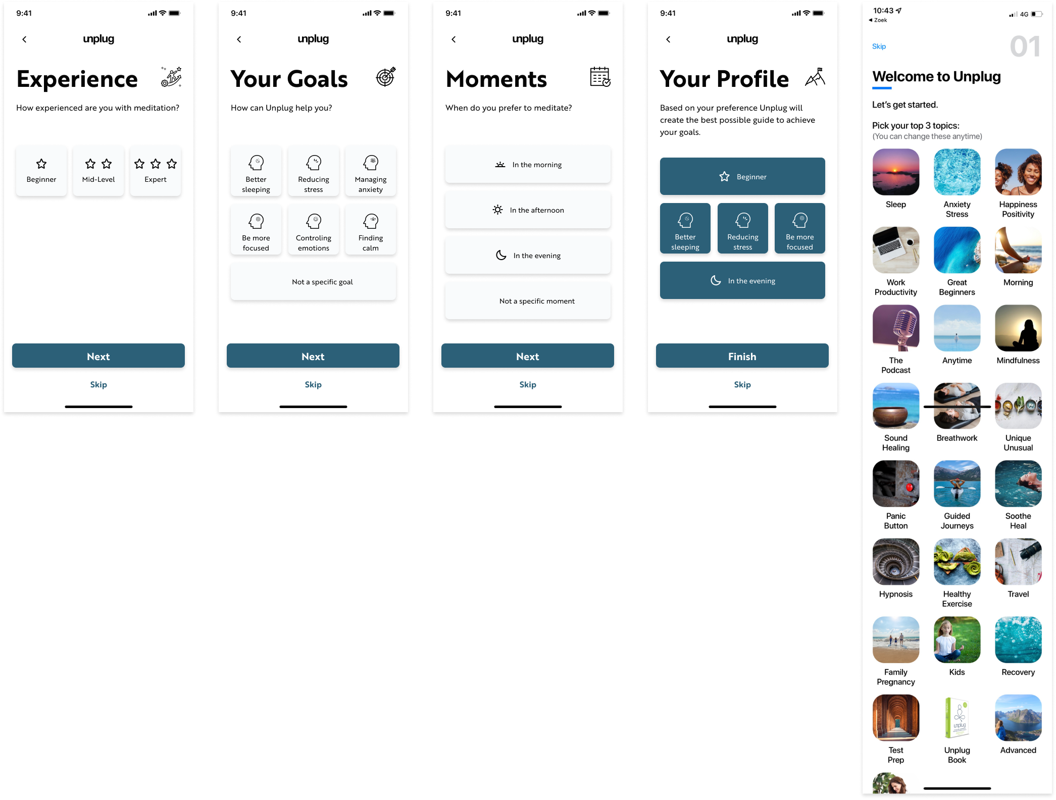
1. Onboarding flow
The current UI gives the user 25 meditation categories to choose from in the onboarding, what causes a broad range of content on the personalized homepage.
The redesigned UI gives the user a clear path to follow, that ensures personalized content on the homepage.
Redesign vs. Current
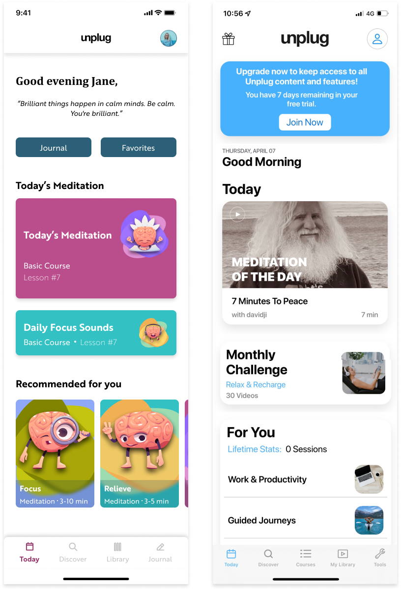
2. Homepage
The current UI gives the user a couple of cards to choose from. The ‘For You’ section shows 0 sessions.
The redesigned UI gives the user personalized content from the onboarding. The monthly challenge is been removed, this can possibly replaced by something less competitive and more inviting.
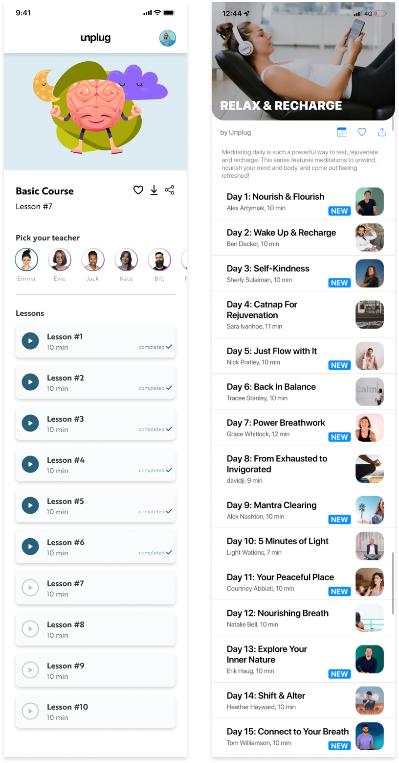
3. Course Detailpage
The current UI gives the user 30 lessons list (only 15 rows are shown on the image below). This is too much information for the user to take in. Also annoying to scroll down every time you are at the end of the course.
The redesigned UI gives the user only 10 of the 30 lessons (rows). The course is divided into 3 courses with each 10 lessons. A new lesson will be unlocked after the previous is completed.
Redesign vs. Current
Redesign vs. Current
4. Discoverpages
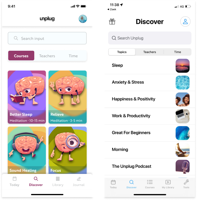
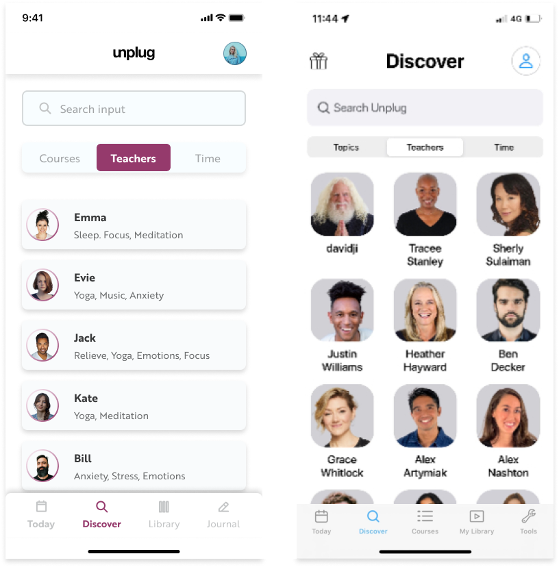
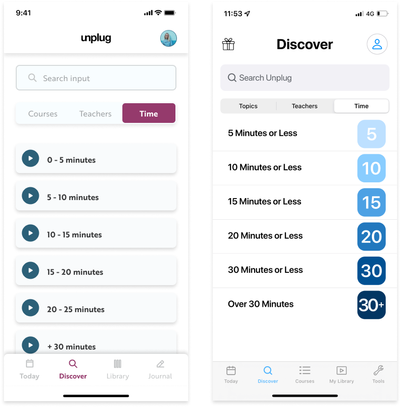
The discover page consist out of 3 tabs, ‘courses’, ’teachers’ and ’time’. Below you find the 3 tabs with its redesigns and suggestions.
‘Course tab’:
The current UI gives the user same information overload, the same 25 categories from the onboarding.
The redesigned UI gives the user more general categories. Create bundles and create layers in the courses to go more into detail on the subject.
‘Teacher tab’:
The current UI gives the user 102 teachers to choose from without any information about them.
The redesigned UI gives the user the option to search a teacher with the search bar. Another suggestion here would be to create favorite teachers in your settings so this tab would be unnecessary. These teachers will then be listed at every course.
Redesign vs. Current
‘Time tab’:
The current UI gives the user 6 options. The redesigned UI gives the user only a new UI redesign.
UX Foundation
- Internal research: Researching Unplug
- External research: Competitors analysis
- Principals of Information Hierarchy
- UI research: Mood boards

